Brand Reference Guide
Visual System
Our brand tells the story of how Empyrean delivers a technological solution with a human touch. The circle provides a foundational element for our visual vocabulary.

A circle represents union, commitment, love or community.
It has no beginning or end and can literally allude to a ring, a closed path, a molecule, a planet, or in the abstract – life and the life cycle. Curvilinear shapes tend to be viewed as soft or feminine in contrast to rectilinear shapes that are rigid or masculine. Empyrean’s circle represents the fusion of tech & service to fulfill our clients needs — the complete software solution for benefits; and a community of teamwork around it.
Corporate Logo
Our logo is an essential part of our visual identity – a universal signature across our communications. It’s made of 2 parts:

1 ) the modern word mark “EMPYREAN” — i.e. a guiding light and ideal place (typeface: Neutraface; reserved for Empyrean name and solutions)
2 ) the “Helping Hand” symbol that simul-taneously references three concepts: a hand, file stack, and the key letter “E”

Service
Assistance
Help

Administration
Documentation
Resources

Empower
Employee
Employer
Provide Clear Space
Allow the mark to live within the space on any given piece of communication. The free (negative) space allows the logo to be clear of clutter and legible at different scales.
It is a good rule of thumb, to provide a minimum margin of clear space the size of the capital letter ‘M’ around the logo as indicated. Prevent graphics or text from encroaching into that margin.
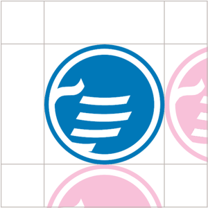
The minimum amount of space around the logo hand symbol should be approximately 30% of the size of the circle.
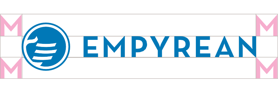
The minimum amount of space around the logo hand symbol should be approximately 30% of the size of the circle.
Logo Variations


Fill Color – Process or PMS, Black, or White
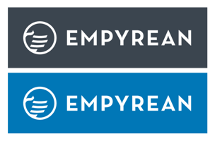
The hand outline logo can be used as an all-white graphic over a background image or color that provides strong contrast
In some cases, the logo may need to be stacked due to limited horizontal space or for a desired effect. Use discretion when applying this format.
Background Colors
The white version of our logo takes on the background color of the field it rests on when the contrast calls for a white logo.
For example, if the white logo rests on a large green background, it will fill the circle with that green color.






Do Not Reverse
Do not make the logo hand symbol into a negative of the original. Always fill the circular element with the darker color.

Logo Best Practices

Do Not Modify
Do not resize or change the position of the logo mark.


Do Not Distort
Do not stretch the logo vertically or horizontally. Resizing it must be proportional.

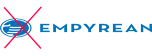
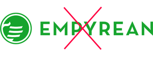
Do Not Change Colors
Do not stretch the logo vertically or horizontally. Resizing it must be proportional.

Helping Hand
The “Helping Hand” symbol is versatile. It can stand alone as a button, seal, or graphic stamp in a field.
It can even be cropped and rotated provided the intended effect is displaying it as a large, hero-element.
Fonts
On print and web communications we use Montserrat for headlines and Fira Sans for body copy. When using a very large headline you can use Montserrat ExtraBold.
Both typefaces should be available on Empyrean issued laptops.

MONTSERRAT EXTRABOLD

MONTSERRAT EXTRABOLD
Font Guidance
When to use:
Headlines and titles — no smaller than 32pt.

When to use:
Titles, subtitles, and copy headlines — no larger than 24pt.

When to use:
Apply to web apps to ensure optimal UX/UI results.
For licensing and consistency we use Montserrat as the lead web font for our on-line solutions, COMPASS, MAP, MERIDIAN, and more...
The font is available here: https://fonts.google.com/specimen/Montserrat

Additional Graphic Elements
Simply stated, Empyrean offers technology and service to the benefits industry. We communicate those concepts in shorthand with the acronyms shown, or visually with the icons. They help to set the stage for dialogue about Empyrean.



Connect Graphics
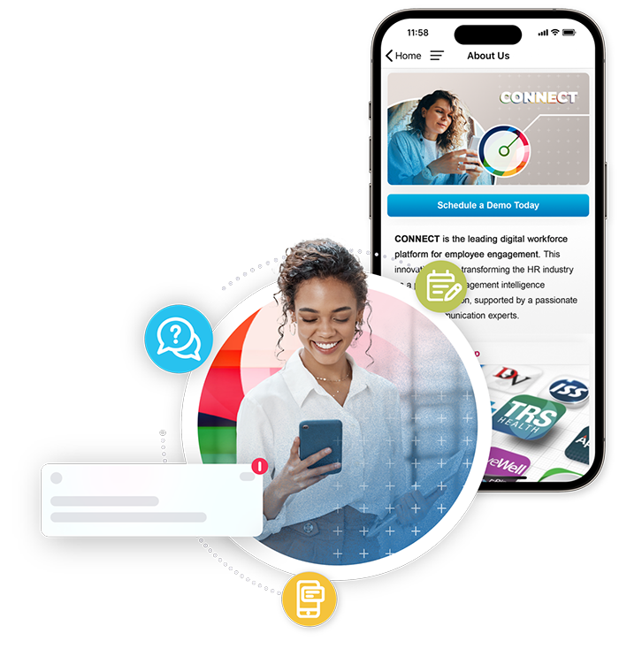
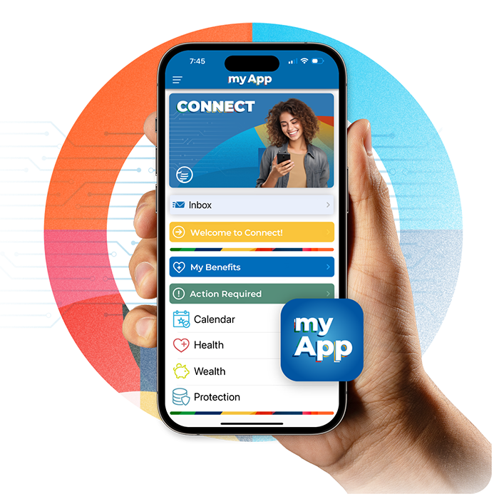
Along with BenefitsGo, Empyrean offers the product Connect. Connect is a team app matching the client's brand, increasing employee attraction, engagement, and retention.


Colors
Our primary resting brand color is Dynamic Blue. Three additional colors support it.
Blue soothes and connotes trust, while the green suggests growth and life. Together they inspire a fresh, cool look, grounded with the gray and white base to provide good contrast and lead the eye.
Warm grey is recommended for text on a white background. Highlight Green is recommended for use on call-outs that emphasize a message or call to action.

Dynamic Blue
#0077B7
R 0 G 119 B 183
CMYK 93 32 0 0
PMS 7461

Warm Grey
#4B4444
R 75 G 68 B 68
CMYK 58 61 54 49
PMS 4273 C

Clean White
#FFFFFF
R 255 G 255 B 255

Highlight Green
#BBC942
R 187 G 201 B 66
CMYK 29 0 79 0
PMS 2298
Secondary Colors
Our secondary colors are the vibrant accent colors that complement our primary dynamic blue. They are used in illustrations, kaleidoscopes, and to highlight/call-out important ‘need-to- know’ information or call to action.
In informal contexts and light-hearted communications, these colors can move into prominent usage as alternatives.

#00B2E1
RGB 0 181 226
CMYK 76 0 0 0
PMS 306

#38879D
RGB 56 127 151
CMYK 75 27 18 14
PMS 4158

#D84E56
RGB 228 75 85
CMYK 0 82 56 0
PMS 4058

#646C6F
RGB 99 102 106
CMYK 57 46 40 25
PMS Cool Gray 10

#3C8E75
RGB 49 156 138
CMYK 74 6 46 8
PMS 2456

#BCB4B0
RGB 191 184 175
CMYK 21 20 21 1
PMS Warm Gray 3

#FFC823
RGB 255 199 44
CMYK 0 16 89 0
PMS 123
Kaleidoscope
Kaleidoscopes provide a simple visual metaphor to communicate the abstract overlapping parts of an active benefits program.
The shapes, lines, and various colors illustrate how all the parts to a benefits program, whether a human touch point or a technical software piece, work together to deliver a harmonious strategy.

This is a hallmark Kaleidoscope that brings vibrancy and dynamic energy to any piece of communication. It can be used in a slim crop rectangle to provide a bookend graphic, or as a shape texture (see examples).
or… make a new one as needed.
When creating kaleidoscopes, begin with circles. Negative and positive spaces should have rhythm and balance. Allow multiply blending methods to create complex color themes without adding to the palette. Keep in mind the golden ratio to achieve the focal points.

Photography
When choosing photography, look for people creating, building, doing, or connecting. The hand images should not be disembodied, but connected – real.
Example themes: crafting, working, genuine gestures (i.e. a hand shake / fistbump), caring.


Avoid stock art imagery that looks staged; overwrought with graphics; faux-virtual; or obviously photo-shopped together.




Work Examples
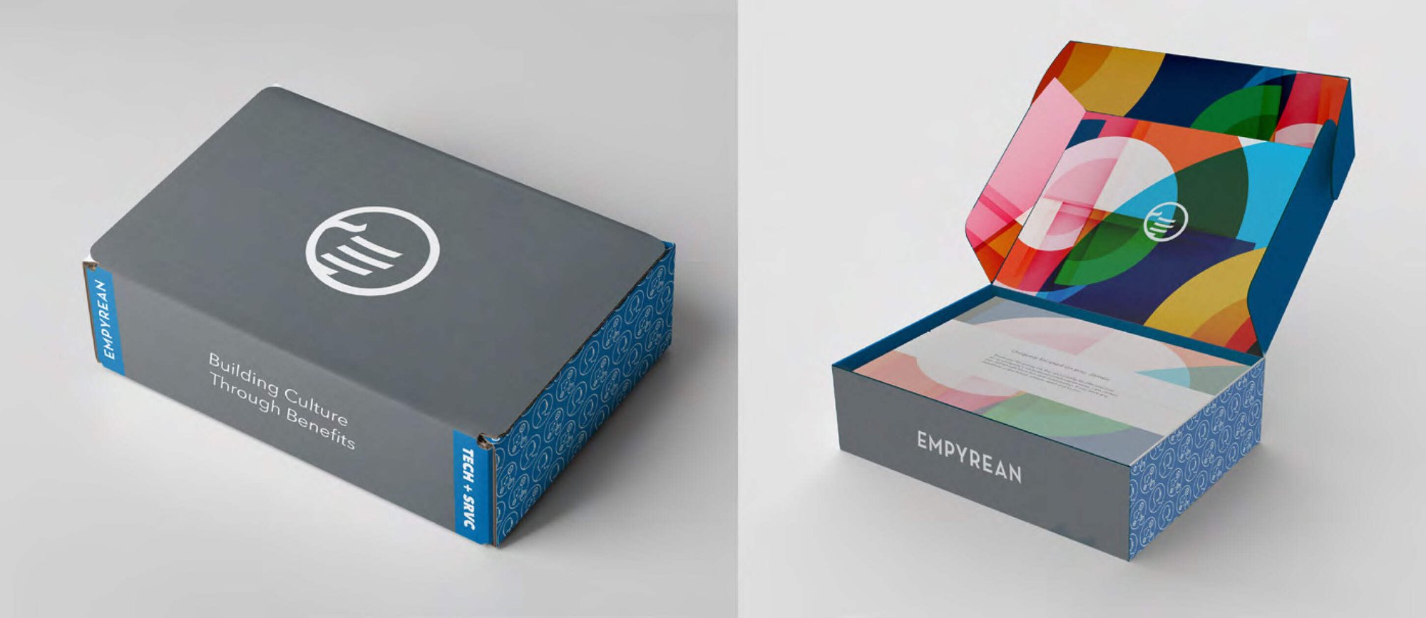
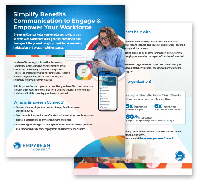
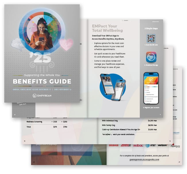
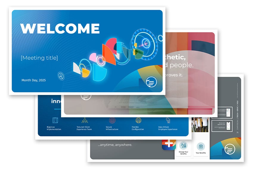
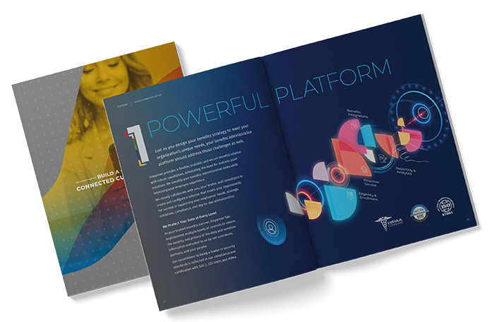
Empyrean Brand Kit
Download guided logo variations, fonts, and graphics.
